When you walk into a coworking space, you notice the colors before anything else. The walls set the mood for your entire workday. They’re not just decoration — colors literally affect your brain chemistry, how focused you are, and whether you feel stressed or calm. That’s color psychology, and it’s one of the most overlooked design tools in office spaces.
We’ve been designing workspace interiors across Hong Kong for over a decade, and we’ve seen firsthand how color transforms productivity. The right palette can boost concentration by 15-20%. The wrong one? You’ll have people leaving their desks every hour because they’re mentally exhausted. It’s that powerful.
Understanding Color’s Impact on Work Performance
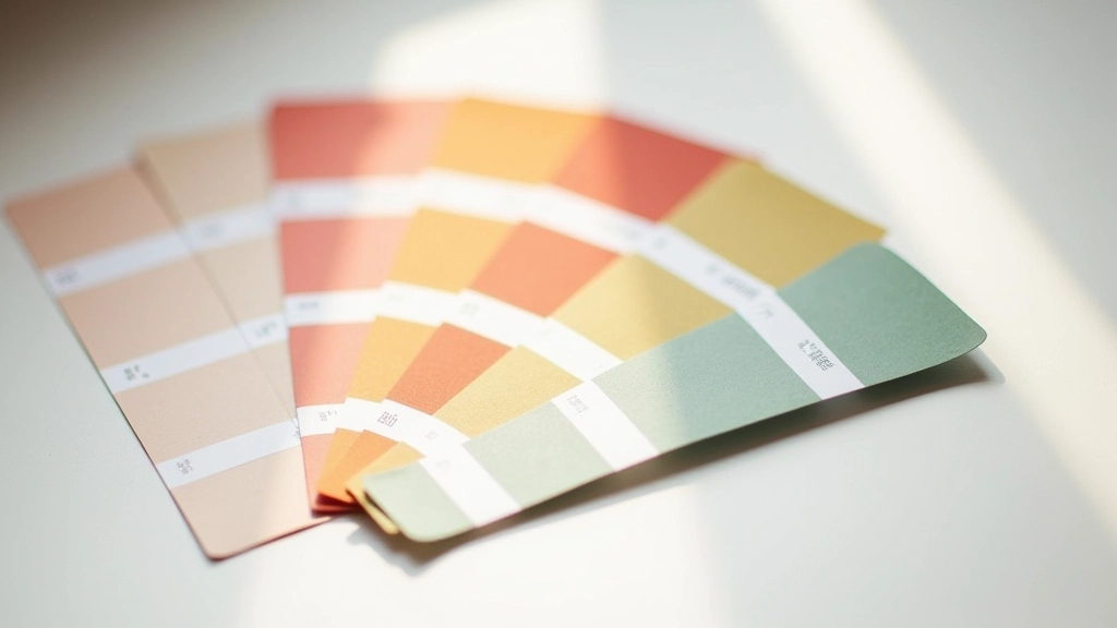
Colors don’t just look pretty. They trigger physiological responses. Blue lowers heart rate and blood pressure — that’s why it’s perfect for focus-intensive work. Green reduces eye strain and promotes calm thinking. Red increases energy but can spike anxiety if overused. Yellow stimulates creativity but causes fatigue in large doses.
The key is understanding what you’re designing for. Are people doing deep analytical work? Are they collaborating? Are they on client calls? Each activity benefits from different color schemes. We typically recommend using 3-4 colors maximum per space to avoid visual chaos. Too many colors overwhelm the brain and actually decrease productivity.
Think of it like this: your office walls are working for or against your team every single day. They’re either supporting focus or draining energy. There’s no neutral choice.
The Four Core Office Colors
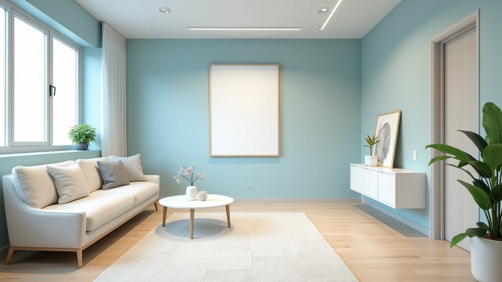
Blue: Focus & Calm
Best for: Individual work, analysis, research. Reduces stress hormones. Use 40-60% of wall space in medium to soft shades (not navy, which feels heavy).
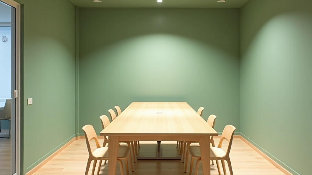
Green: Balance & Creativity
Best for: Collaborative areas, brainstorming zones. Suggests growth and renewal. Pair with warm neutrals to prevent a clinical feel.
Warm Neutrals: Stability
Best for: Reception, transition spaces, break rooms. Beige, taupe, and warm grays create confidence without overstimulation.
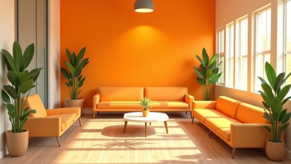
Accent Colors: Energy
Best for: Feature walls, creative zones. Yellow (small doses), orange (energizing). Never use more than 15% of space — it burns out fast.
Designing by Zone: The Three-Area Approach
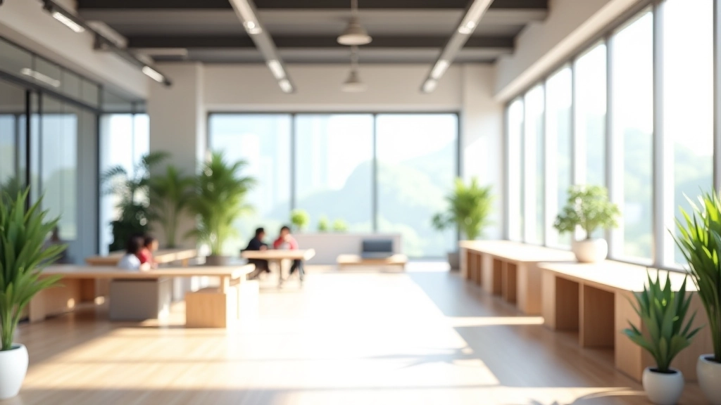
Not every area of your coworking space should feel the same. You’ve got different activities happening in different zones. We design around three functional areas, and each gets its own color strategy.
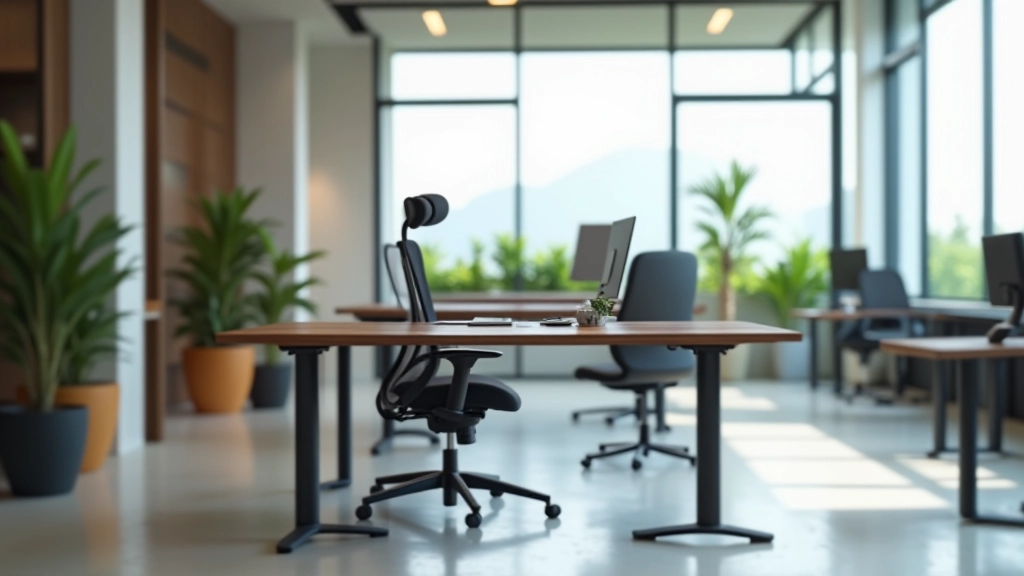
Focus zones (individual desks, private booths) need blue or cool gray. These colors activate the parasympathetic nervous system — the “rest and focus” mode. Pair with minimal visual clutter and soft lighting. People working here should feel they can disappear into their tasks.
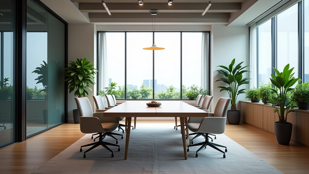
Collaboration zones (meeting rooms, open areas) benefit from green or warm white. Green signals permission to think creatively. It’s not as intense as white, which can feel sterile. Add wood tones and natural materials to make it feel welcoming.
Break areas should shift entirely. Use warmer tones — soft yellow, warm orange, or peachy tones. These spaces are meant to help people recover mentally. The color shift tells your brain “you’re off the clock now.”
Practical Implementation Tips
Start with Accent Walls
Don’t paint the entire office blue on day one. Try one accent wall or one zone. You’ll see the effect within 2-3 weeks. People naturally gravitate toward areas that feel right for their work. Then expand based on what works.
Consider Lighting Carefully
Colors look completely different under fluorescent, LED, and natural light. Cool colors (blue, gray) look better under LED. Warm colors need natural or warm LED. Test samples in your actual space under actual lighting conditions. We’ve seen color choices fail purely because the lighting wasn’t right.
Use 60-30-10 Rule
60% dominant color (usually neutral), 30% secondary color (blue or green), 10% accent. This creates visual interest without overstimulation. Humans brains find this ratio naturally balanced.
Don’t Forget Ceiling Color
Ceilings affect spatial perception. Light colors (white, soft gray) make rooms feel larger. Darker colors make spaces feel more intimate. For open coworking areas, keep ceilings light — they need to feel spacious even when busy.
Real Results from Color Changes
We worked with a coworking space in Tsuen Wan last year that had gray walls everywhere. Gray, gray, gray. It looked professional but felt corporate and exhausting. After six months, they were losing members who’d say things like “I can’t focus here” or “It feels draining.”
We repainted the focus areas soft blue (#5B8DBE), left the collaboration spaces a soft green (#7BA68F), and made the break area a warm cream with one orange accent wall. We didn’t change anything else — same desks, same layout, same lighting.
Within three weeks, member feedback shifted. People stayed longer. They booked focus booths more frequently. The break area actually got used instead of being ignored. One member said “I don’t know what changed, but I actually want to be here now.” That’s color psychology working.
Making Your Color Strategy Stick
The biggest mistake we see? Choosing colors based on trends instead of function. You’ll see coworking spaces with trendy millennial pink everywhere, and it looks great in Instagram photos but drives people crazy after a week because it’s overstimulating.
Your color strategy should match what people actually do in each space. If it’s a focus area, it needs to support concentration. If it’s collaborative, it should encourage communication. If it’s a break space, it should help people genuinely rest.
Start small, observe how people respond, and adjust. Color isn’t permanent — paint is one of the easiest design elements to change. But once you get it right, you’ll see the difference in member satisfaction, retention, and how the space actually functions day to day.