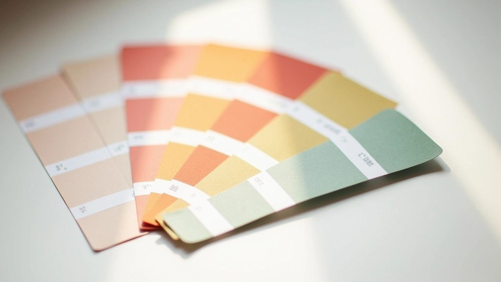
Color Psychology for Office Environments
Different colors affect focus, creativity, and mood. We’ll cover which palettes work best for different work types and how to use color to define zones in open spaces.
Read ArticleHow to maximize functionality when square footage is limited. Real techniques from designers working in Hong Kong’s tight office markets.
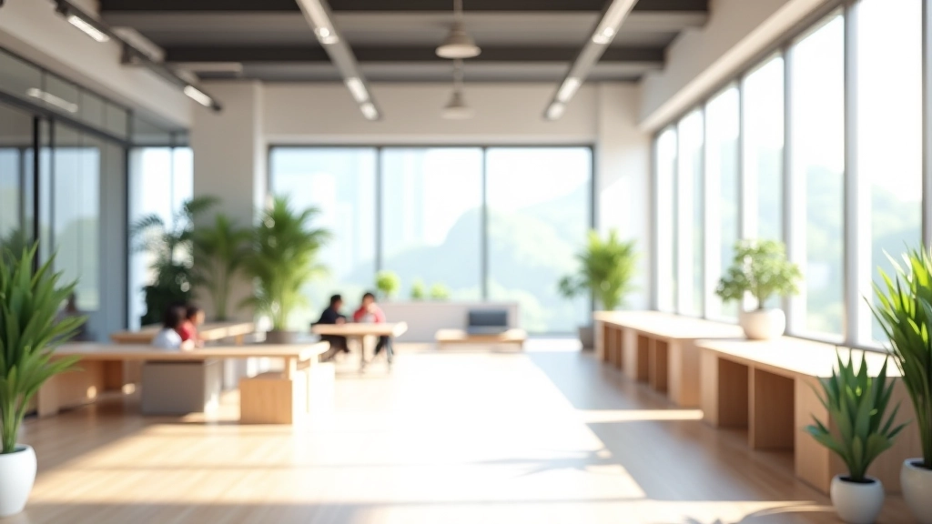
Small spaces don’t have to feel cramped. The trick isn’t adding more—it’s arranging what you’ve got smarter. We’ve worked with dozens of coworking operators and office managers in Tsuen Wan who started thinking their 800-square-foot floor would never work. Then they changed how they organized it, and suddenly it felt spacious.
The difference comes down to three core principles: sight lines, movement flow, and layered functionality. You’re not just squeezing furniture in—you’re designing how people actually move through and use the space. It’s the difference between a cramped box and a space that breathes.
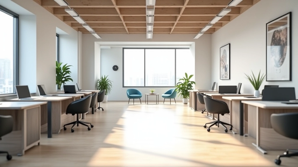
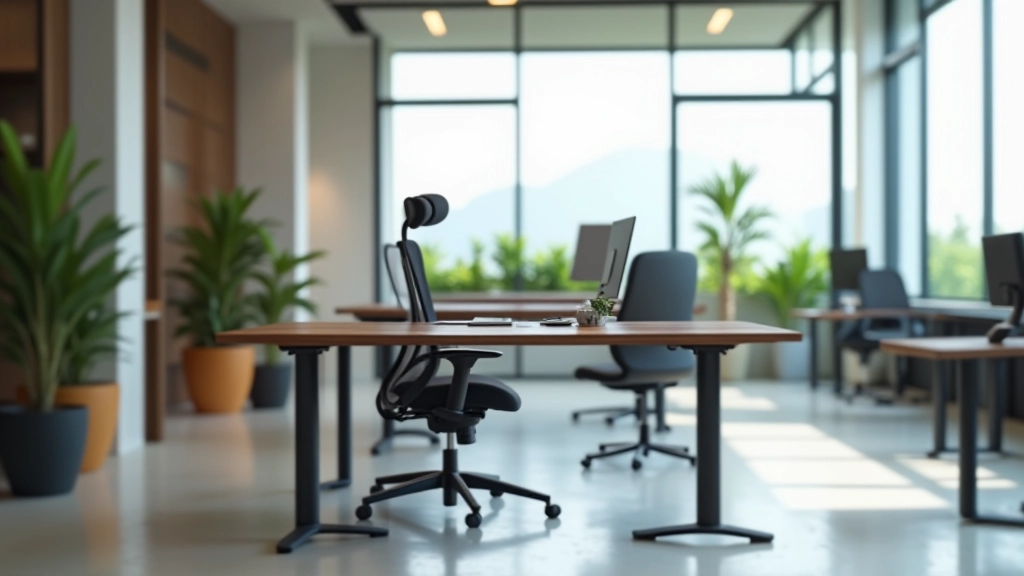
The first thing you notice when you walk into a tight space isn’t the actual size—it’s how far you can see. Block the view with tall furniture or cluttered desks, and 1000 square feet feels like 400. Keep sightlines clear, and everything opens up.
This doesn’t mean empty. It means being intentional. Use furniture under 42 inches tall where people need to see across the space. Desks, low shelving, seating arrangements—keep them low in the main areas. Reserve your taller pieces (storage cabinets, room dividers, shelving) for corners or dedicated zones where they won’t block views.
In one Tsuen Wan office we redesigned, they’d placed a 60-inch tall filing cabinet dead center. Moved it to a corner, and suddenly the whole space felt 30% larger. Same square footage, completely different experience.
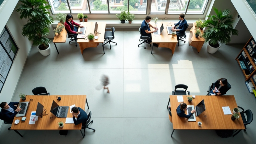
People don’t just sit at desks. They move to the printer, grab water, go to meetings, step outside. How they travel through the space matters as much as where they work. Create natural pathways, and you’ll be amazed how efficiently the space functions.
Start by mapping your actual traffic patterns. Where’s the entrance? The kitchen or break area? Meeting rooms? Now trace a path between each. Your layout should create a clear flow—not a dead-end maze. Avoid placing desks directly in front of doors or blocking pathways to high-traffic zones.
We typically aim for 2-3 meter-wide corridors minimum. Narrower and people start feeling squeezed. Wider than 4 meters and you’re wasting productive square footage. It’s about rhythm and balance.
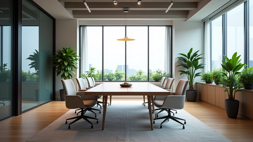
Allocate your compact square footage this way: 70% for individual work zones and focused tasks. 20% for collaboration areas—tables, open seating, informal meeting spots. 10% for storage and support functions. This ratio keeps spaces functional without overwhelming the layout.
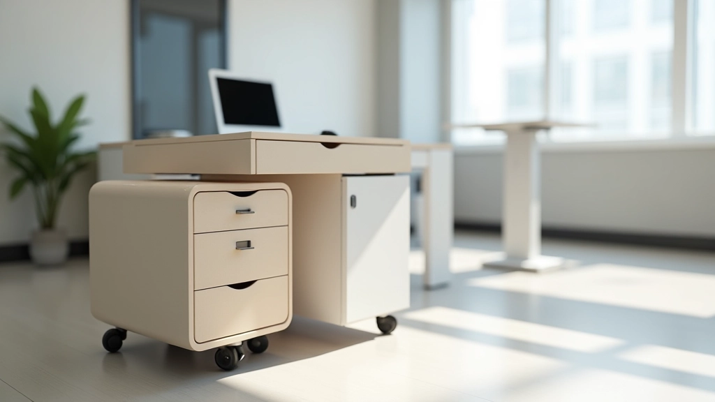
In compact spaces, every piece needs to earn its place. Don’t buy furniture that only does one thing. You’ll want pieces that can shift purpose or provide storage alongside function.
Ottomans with hidden storage. Tables that adjust height for standing or sitting. Shelving that divides space while staying open and visual. Mobile carts that move where they’re needed. Wall-mounted desks that fold up. These aren’t gimmicks—they’re essential in tight layouts.
The key is choosing furniture on legs, not solid bases. Even a low sofa on visible legs lets you see beneath it, maintaining those crucial sightlines. Solid blocks make spaces feel heavier and smaller.
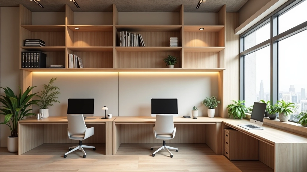
When you don’t have floor space, build up. Vertical storage and organization dramatically changes what a compact space can hold without feeling cluttered. Wall-mounted shelving, tall narrow cabinets, floating desks—these pull your eye upward and make ceilings feel higher.
This isn’t just about cramming more stuff in. It’s about visual balance. A room stuffed with equipment on the floor feels chaotic. The same equipment stored on walls and shelves feels organized and intentional. You’re also freeing up floor space for movement and openness.
We recommend dedicating at least one full wall to vertical storage in compact spaces. Keeps everything accessible without consuming valuable floor area.
Compact office spaces aren’t a limitation—they’re a design challenge. You’ve got to think harder about every choice, but that discipline actually creates better, more focused environments. Clear sightlines keep things feeling open. Smart traffic flow means people aren’t constantly navigating around obstacles. Furniture that serves multiple purposes prevents clutter from accumulating.
The spaces we’re most proud of in Hong Kong aren’t always the biggest ones. They’re the ones where every square meter has purpose, where people feel comfortable moving and working, where collaboration happens naturally. That’s what good design in compact spaces really means.

The information provided in this article is for educational and informational purposes only. While based on industry best practices and professional experience, specific design solutions depend on your unique space, budget, building codes, and requirements. We recommend consulting with a qualified interior designer or architect before implementing major layout changes. Local building regulations in Hong Kong may affect your project—always verify compliance with your building management and relevant authorities.